Remodeling a Space-Challenged Philly Bathroom - a Wink to Modern Trends
The work of a DRemodeling designer is never without challenges, unique to every space at that. Luckily, we’ve got the likes of Devin heading up this department and we couldn’t be in better hands! By way of a play-by-play of her process, she’s let us in on the work that went into remodeling a Philadelphia en-suite bathroom. Have a look!The goal? Functional bathroom, modern materials to please the eye


The clients wanted a bathroom that they would relish walking into in the morning – isn’t that what we all want after all? To achieve that more-than-the-sum-of-its-parts ideal, DRemodeling had to look at both the bathroom and the bedroom – because the latter one housed the sink, a holdover feature from earlier times. While the sink was inconveniently placed, the bathtub had to go altogether, as the clients’ busy schedules rarely left them with any time, or yearning, for a protracted bath – a request, by the way, which we hear more and more nowadays. With these challenges in mind, Devin’s team went to work on incorporating a modern, sleek-looking shower, a vanity and a storage space into the new bathroom.
Blending tiles to achieve a modern/transitional style

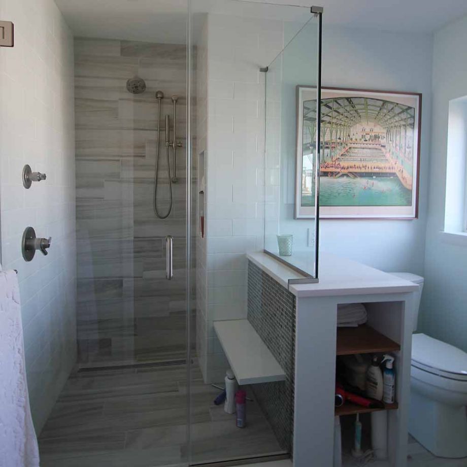
Every bathroom comes with its one-of-a-kind list of features and limitations, but there is, still, a common thread to these modern/transitional beasts. So we knew, for instance, that we wanted to bring the old and the new into fine-tuned alignment and achieving that rested heavily on materials and the color palette. The clients were interested in adding some unique features to the room, including a glass mosaic, wood-look ceramic tile, and stark white quartz countertops. So our team obliged, injecting the bathroom with a style that looked cohesive without being “matchy-matchy.” The wood-look tiles chosen for the floor run all the way into the shower, and up its rear wall, stopping only at the ceiling. Once these tiles in place, you’re just one step away from imagining the shower hose as a stylized creeper stalk – and the modern artsy feel is doubled by a half-wall clad in finely polished tumbled-glass tiles. Complemented by a corner swath of white subway tiles – a custom 4x12 size to play off the tiles underfoot – the effect of this tile trifecta is remarkably soothing on the eye. Furthermore, it lets light glint off the varied surfaces in surprising ways.
The cool pastel color palette was selected to feel calming and serene in addition to neutralizing the sunlight coming from the East-facing window. (Devin)
Circumventing the limits of square footage in a bathroom

The separator half-wall was made to double as an in-shower bench as well as a storage space on the outside of the shower – with a recessed niche for toiletries cut out in the subway-tile wall inside. These little space-efficient tricks and the wall-mounted vanity with an off-set sink nestled on the opposite wall of the bathroom converged to lend it a stylish, modern look. All in all though, Devin concludes, “the shower was definitely the standout,” not least of all thanks to the custom enclosure that in and of itself upped the modern factor in the room tenfold.
☎ CONTACT
We know how daunting a bathroom remodel may look to the untrained eye. We understand that “gutting a room" is not the most fortunate of terms and that you feel your throat closing up at the mere thought of it. But if you get a team of professionals involved the minute the idea forms in your head, there’s no more need to worry. Just pass the task over to them and get ready to feel like you’re stepping into Narnia when you come back home to your new bathroom! Call us, our team of designers thrive on challenges – the bigger, the better!


Leave a comment